

UniquelyLk
Founder, designer and maker · Ongoing
Building and marketing a hand-painted glassware brand
UniquelyLk is my own business. I hand-paint glassware — vases, wine glasses, bottles and shell art — and sell it at wineries, farm markets and craft events across South Jersey, alongside an online store.
Everything a customer sees, I make: the product, the logo, the flyers, the photography, the booth, the posts. It's the only work I do where I own the whole chain, from the object to the ad to the person deciding whether to buy it.

Hand-painted cylinder vase — jellyfish. Layered blue and glitter with real shells set into the glass. Designed, painted, and photographed by me.
What I Do
-
Brand — logo, palette, booth banner and table presentation
-
Event marketing — flyers, social graphics and story assets for every event, sized for Instagram and Facebook
-
Product photography — shooting finished pieces for listings and social
-
Short-form video — Reels for Instagram and Facebook: painting process footage, and motion pieces assembled from product stills
-
E-commerce — Square storefront, listings and pricing
-
Partnerships — vending at Nauti Spirits Distillery and Just Be Farm's Creative Collective, and teaching paint-and-sip workshops
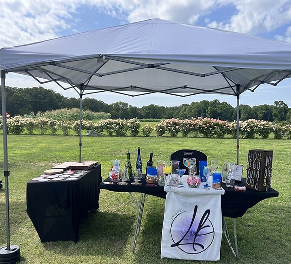
Booth setup at Nauti Spirits Distillery. Two tables, a branded banner, and about forty pieces — the whole business fits in a car.
Running this taught me more about designing under real constraints than any brief ever has. There's no budget, no team, and the deadline is an actual Saturday with actual people showing up. Every choice gets tested immediately — if a flyer doesn't work, nobody comes to the table.
Hand-Painted Glassware
Click image to enlarge


Event Marketing
Click image to enlarge


Building a flyer system
Click image to enlarge
Every event used to mean starting a layout from scratch, and the results didn't look related to each other. I built a locked template to fix that: a fixed grid and margins, two typefaces, the logo and call-to-action in the same place every time, and a seasonal accent palette checked for color contrast so the type stays readable on a phone in daylight.
The point is that only the art and the words change. Same bones, different season — and each flyer takes fifteen minutes instead of two hours.


Harvest Hues Workshop — redesign, 2026
Click image to enlarge
My own flyer for a paint-and-sip workshop I taught in 2025, rebuilt a year later against a design system I put together for the business.
The original used four typefaces and a low-contrast headline, and the finished piece was too small to see. This version cuts to two typefaces, puts the product at hero size, and moves the call to action into a full-width bar. Same event, same information, roughly a quarter of the decisions.

